OG Maker
ogmaker.iwhy.dev/ →Stop sharing links with that boring gray card
WHAT IT SOLVES
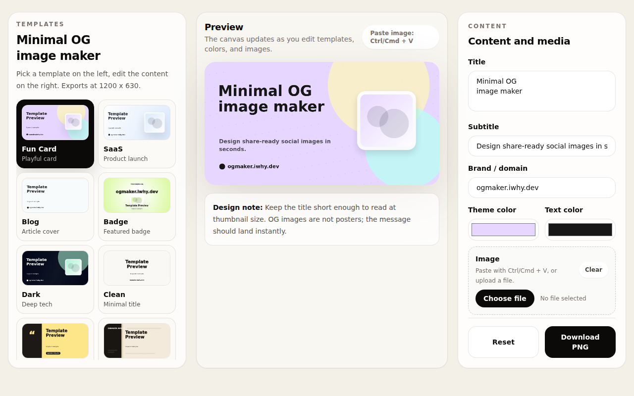
Every blog post or project page needs a social preview image. Either you skip it and get an ugly gray card, or you open Figma, find a template, tweak the layout, export at 1200x630 — all for one image
WHY IT'S INTERESTING
20 templates, but the design note is one line
At the bottom of the canvas there's a single design note: keep the title short enough to read at thumbnail size. That one line tells you the author actually made OG images before and learned the hard way — most tools give you templates but never explain what makes a good one
20 templates across 7 distinct use cases — not random filler
Fun Card, SaaS Product, Blog Article, Badge, Deep Tech, Quote, Poster, Insight Report, Release Note — each with distinct layout logic. You can tell the author actually thought about what developers need for different contexts, not just recolored the same template 20 times
Ctrl+V to paste images — zero friction
Paste a screenshot or logo straight into the canvas with Ctrl+V — no upload dialog, no drag-and-drop. This kind of dev-workflow-native interaction comes from someone who built it for themselves first
「"Keep the title short enough to read at thumbnail size. OG images are not posters"」
TECH GUESS
Likely pure frontend — Canvas API or html2canvas for live preview and PNG export
Discussion (0)
- No comments yet — be the first.
Related
 #229▶ 136
Upload your textbook. AI teaches it back to you, chapter by chapter
 #228▶ 112
Someone needs to watch the AI spend meter
 #227▶ 184
Your users are kittens. Don't let them fall off the cliff